
HYPRODUCTION
Task 1 : Vormator Character & Trading Card Design
26.08.2021 - 24.09.2021 (Week 1 - Week 5)
Tan Hui Yue (0332717)
Bachelor of Arts (Hons) Interior Architecture
Illustration & Visual Narrative // Task 1

INSTRUCTIONS
Exercises 1 : Typographic Systems & Type and Play
Exercise 2 : Trading Card Design
SUBMISSIONS
24/9/2021, 11:59pm
.jpg)
.jpg)
LECTURES
WEEK 1
- No Lectures -
For week 1, Lecture gives us a warm welcome and introduce us to this module and brief us through the module information booklet and assignment brief and tracker for us to have a better understanding of what we gonna learn in this module and what we are expected to produce for our assignment.
WEEK 2 / Introduction to Character Design
Second week of the class, we start of with sharing our favorite character, and then further proceed to learn about the characteristic of each character, seeing them in a way that we never see before, observe the silhouette and the shape of the character, charismatics, choice of colours scheme, etc. It was really eye opening to me as I never really look into all these detail when I'm watching the movie and after the lecture class, I realized how much different those small details could give to a character.
This is really interesting as we never realize the devil
character normally come in a shape that is not so stable
(Having a smaller base)


WEEK 3 / Visual Techniques : Composition (1)
This week we learned about how a composition affect the overall visual. Beside composition, we also need to be able to identify types of shots such as Establishing, bird's eye view, framing, medium shot, close-up and worm's eye view. Lecturer also emphasize of the distribution of Positive and Negative to create the visual hierarchy. And we also have some small class activities on identifying the positive and negative space from the picture shown.


WEEK 4
- No Lectures (Malaysia Day Public Holiday) -
WEEK 5 / Visual Techniques : Chiaroscuro
Chiaroscuro which Chiaro refer to bright and scuro mean dark, together they are use to create the illusion of three-dimensional volume on a flat surface. Chiaroscuro is very important which have a heavy usage in different form of design. Beside light and dark, lecturer also told us, having rhythm in art is one of the most difficult aspect to achieve or explain, which I absolutely agree on it as it took so many details to form the rhythm in an art pieces. From this class, I was also impressed by one of the art piece that lecturer shared with us as it doesnt only looks nice, yet the composition and colour usage and spatial feeling is so interesting.


EXERCISE 1 : VORMATOR CHARACTER
Requirement : 600 x 600 px
For this exercise we are required to create a character using the 8 vormator element provided. It is kind of fun as I get to experiment with the element and form different type of combination thru varies method like subtract, addition, rotate and so on. Never know that 8 element can have so many possibility in creating interesting shape, it is also very satisfying during the process of experimenting with the shape and character. The things I find it hard is that, if we sketches first then only create the character in Adobe Illustrator, sometime it looks nice in the sketches but when applying with the vormator element, since we are not allowed to tilt or make any transformation to alter the shape, sometime there is certain angle or shape that I couldn't form it using the vormator element and it is kind of frustrating. The second hard things that I faced would definitely be applying colour to the character as when I experimenting and creating the character I somehow forget to consider about the colour choice and applying colour in Adobe Illustrator is way harder than Photoshop (to me) so it took me so much time try and error.

Experimenting possible combination that can be form among the same element.

Experimenting possible combination that can be form between different element.


Some sketches

First line draft, experimented to use badge as the head but it doesn't turn out well.

As the body part looks too long so I experiment with different element and end up choose to use "the wurst" to make the leg
for my character and also to make the body looks less awkward and I've selected "the cobra" as the connector which also to give people to be able to visualize how it walk or move the body (Like a scissors). Also after several try, I've refer to Mike from monster ink having a big eye which make it stand out from all monster, applying same concept, I make the purple head with a big big mouth showing it's teeth and give a mysterious feeling of whether is he a good or evil monster.


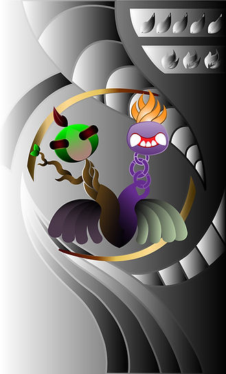
And this is my vormator character, Mirazaer.
EXERCISE 2 : Trading Card Design
Requirement : 897 x 1479 px
So after done creating the vormator character, we continue with design a trading game card for our character.
I'm actually quite excited for this but sadly due to heavy workload I didn't happen to have too much time to explore around and experiment too much, but still manage to at least try out experiment a bit. I actually have difficulty in doing the background for the game card as the bottom part of my character have quite dark scheme colour at the same time it also have a kind of light green colour leg on the other side, which make it hard for me to decide the background colour as it will looks like either floating or some part will merge into background.


First draft sketches and trying out to put the character together with the background in illustrator.


Trying out with different style of background and different style of card design layout composition.
It's a bit interesting that after I make the character upside down it actually give a more demonic feeling.
Even though my friend give me feedback that the design on left is very doable and easier to amend, but end up I didn't choose to proceed with that design as the card layout is kind of typical to me and I would want to try some different composition and see how it can turn out and whether is it practical for a trading card design.


Draft sketches before proceeding to illustrator.


Line draft.


.jpg)
.jpg)
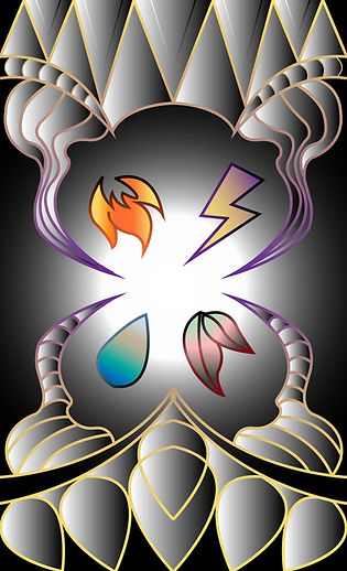
Trying out with monochromatic gradient. Personally I actually prefer it to be in Black and white monochromatic colour with a little gold effect and highlight of green, purple and yellow. But at the same time I do not want to neglect the chance given to explore and try out so I still continue to proceed with more colourful trading card design.

Some random screenshot
.jpg)
.jpg)
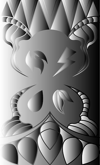
Trading card design - Back
Trading card design - Front
REFLECTION:
I do enjoy myself a lot throughout the process of experimenting, learning and also adapting to a whole new software (Adobe Illustrator), it was a fun project indeed. Even though I didn't produce a design that I can be super proud of myself but I still happy with my current outcome as it was also my current best. Sadly due to lack of time, I didn't manage to capture and document the process of experimenting with the colour and background. I also think that I should show more of my work progress to lecturer instead of just keep quiet and hiding during the class as I always think that the progress still not good enough to show to lecturer. But I think this is not a good move as I could have get some helpful and constructive feedback from the lecturer and able to get a clearer thought and aspect to focus and improve on, then produce a better outcome. Lastly, I'm really grateful to have such inspiring lecture and also classmate which is so interactive during the class.